TABI COLD + FLU
Packaging Design, Brand Identity
STUDIO | Fall 2024A collaborative brand and packaging system that reimagines cold and flu medicine brand for day and night usage marketed towards first time customers, young adults, focuses on limiting product loss, creating a positive dosing experience, and making it transportable.
PROBLEM STATEMENT
The experience of purchasing and using day & night cold/flu medicine is overwhelming and stressful due to the lack of distinction between current brands in market, and current options are environmentally unsustainable.
DESIGN OBJECTIVES
SUSTAINABILTIYHMW focus on avoiding product loss + using environmentally conscious materials?
TransportabilityHMW design with the ability to take on-the-go?
ACCESSIBILITYHMW improve the pill dispensing process to make dosing easier?
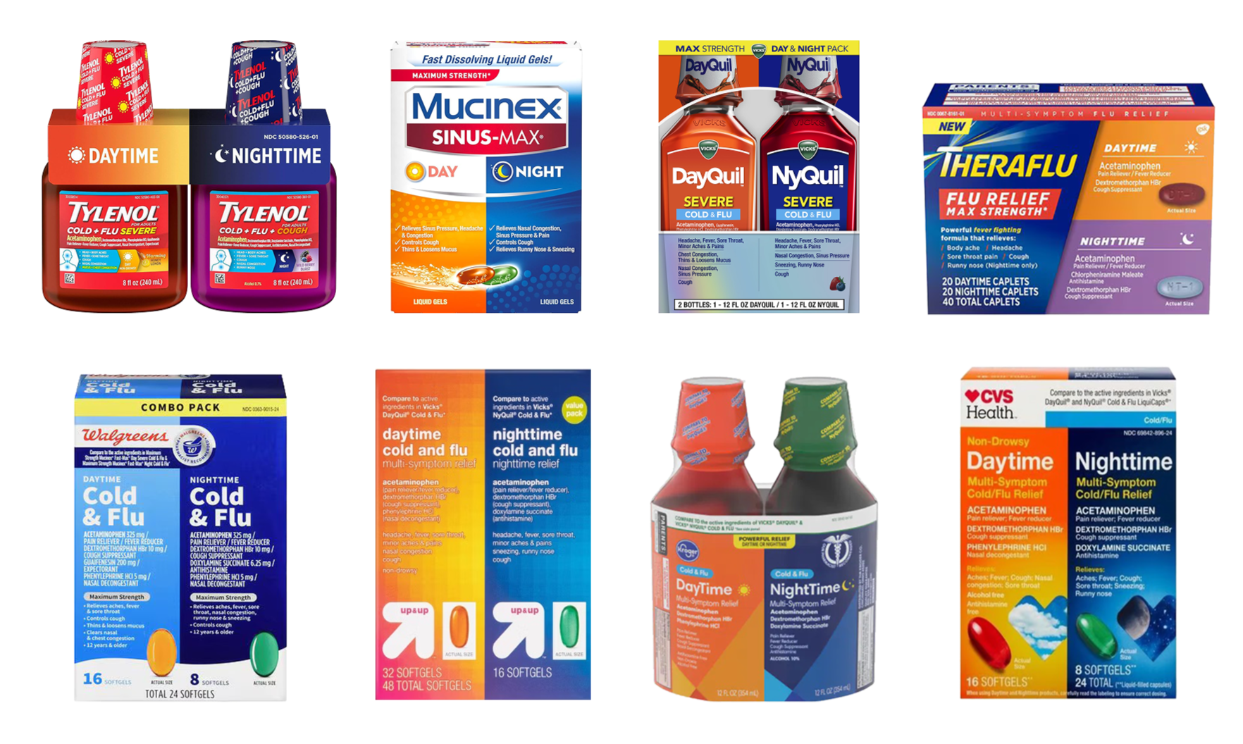
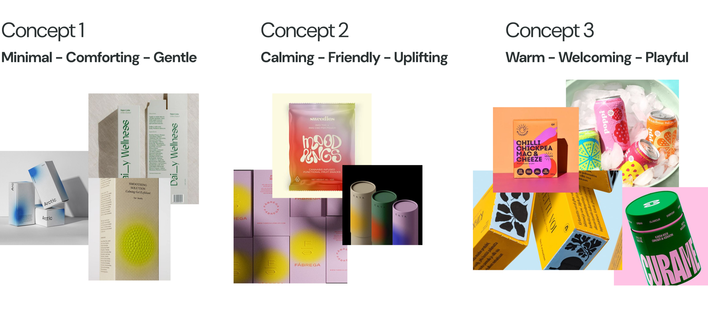
COMPETITIVE LANDSCAPE
graphical dichotomyopposing colors to create contrast and communicate different products
blister packaluminum backing with plastic cell for convenient dosing
plastic materialitybottles with inconvenient dosing experiences covered in plastic seals
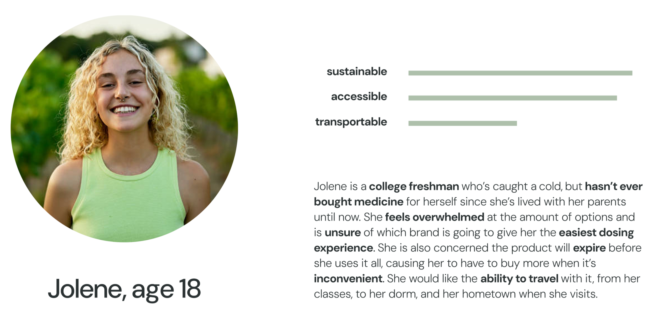
PERSONA
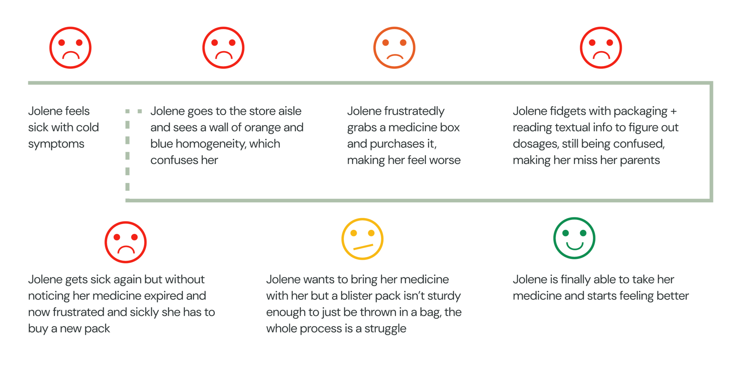
USER JOURNEY
CONCEPT DIRECTION
VISUAL EXPLORATION
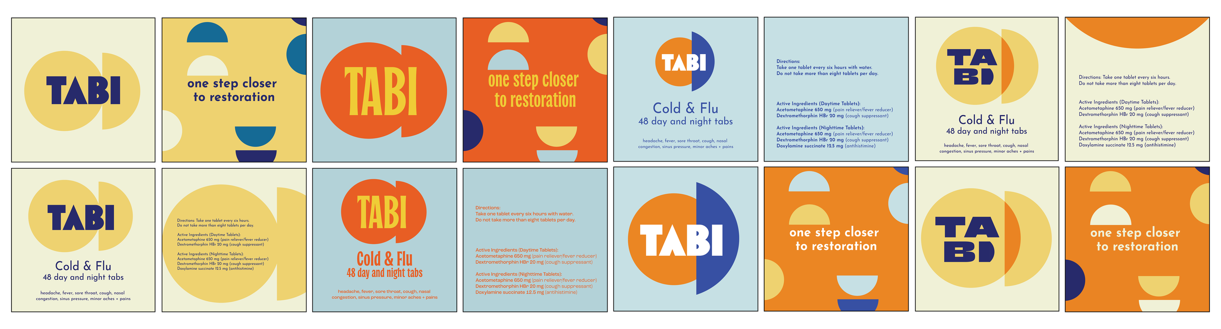
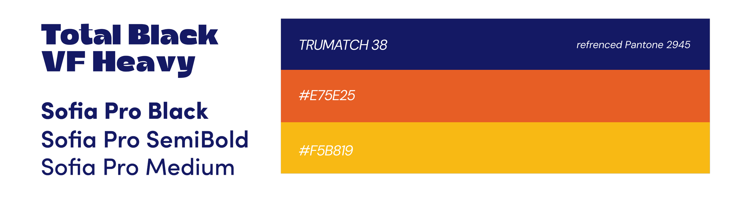
VISUAL IDENTITY
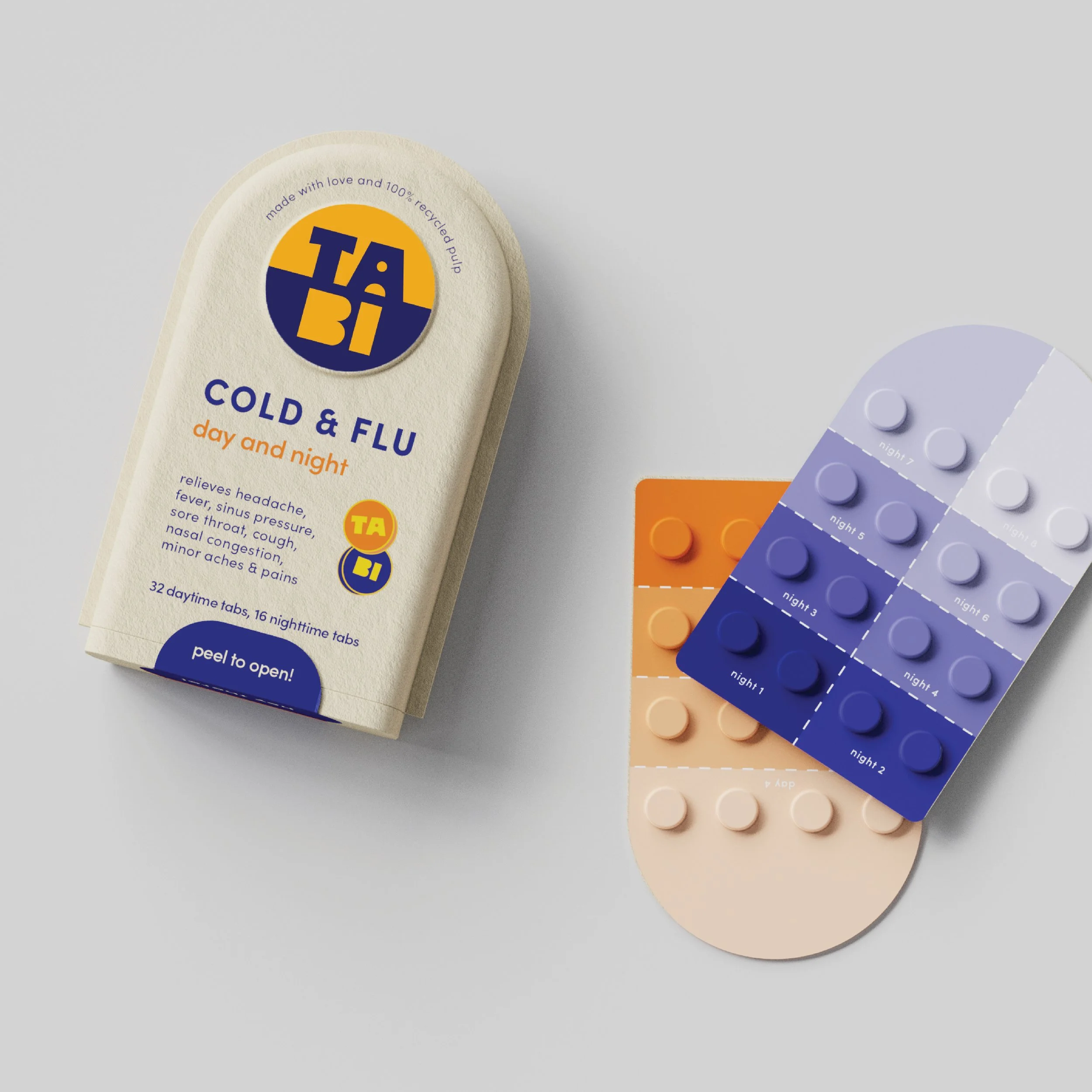
Creating a humanistic, welcoming brand through use of bold, friendly typeface choice, Total Black VF Heavy and balancing with Sofia Pro. Color choices were based around an uncoated spot color for unique print appearance on shelf.

WORDMARK DEVELOPMENT
BRAND PERSONALITY
WHO WE AREWe aim to make people feel better by creating a trusting brand that is easy to use, aiming to combat any feelings of distress and provide relief.
MISSIONOur mission is to create a better medicinal experience aiming to heal, restore, and comfort users when using Tabi.

user journey
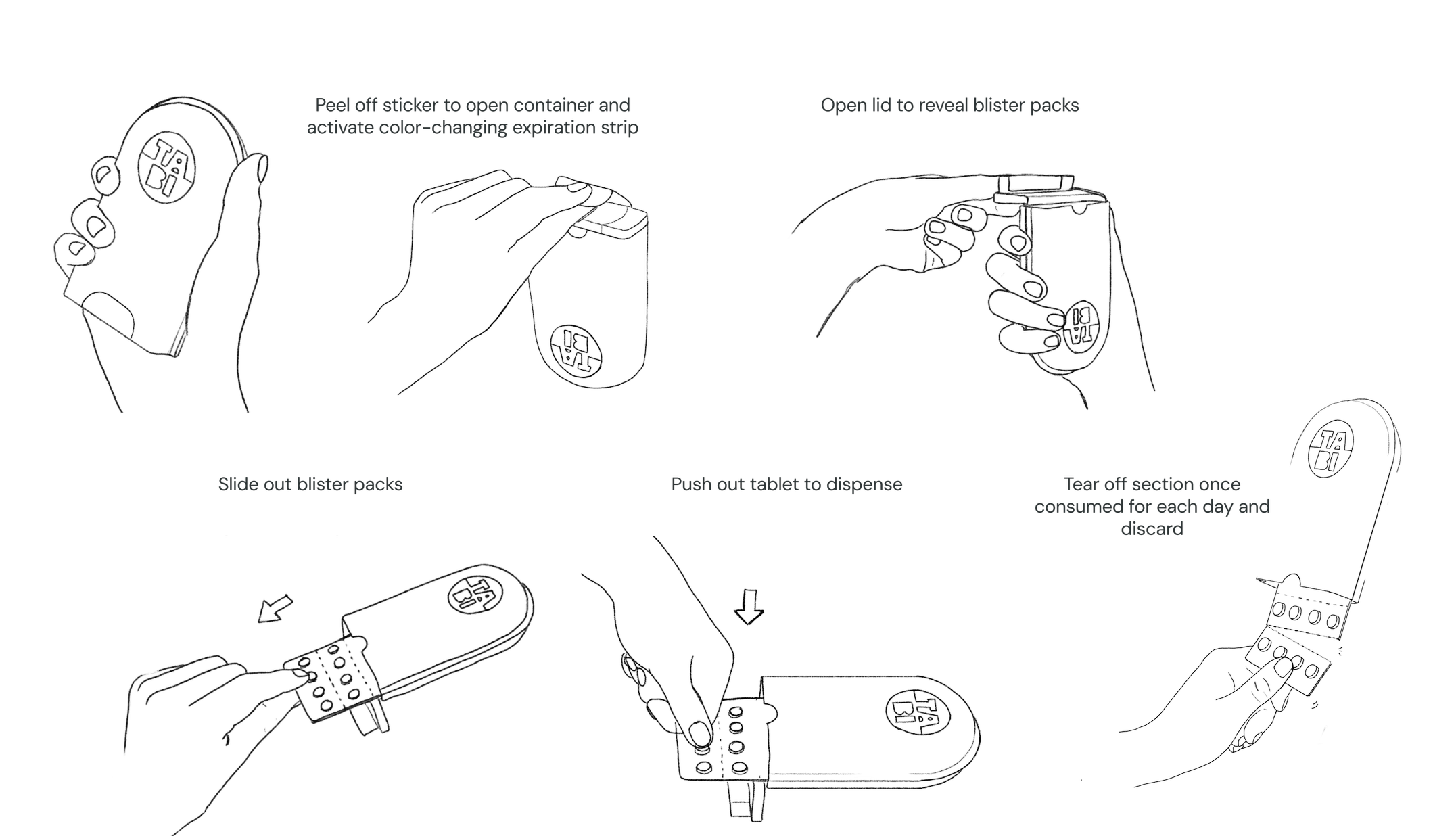
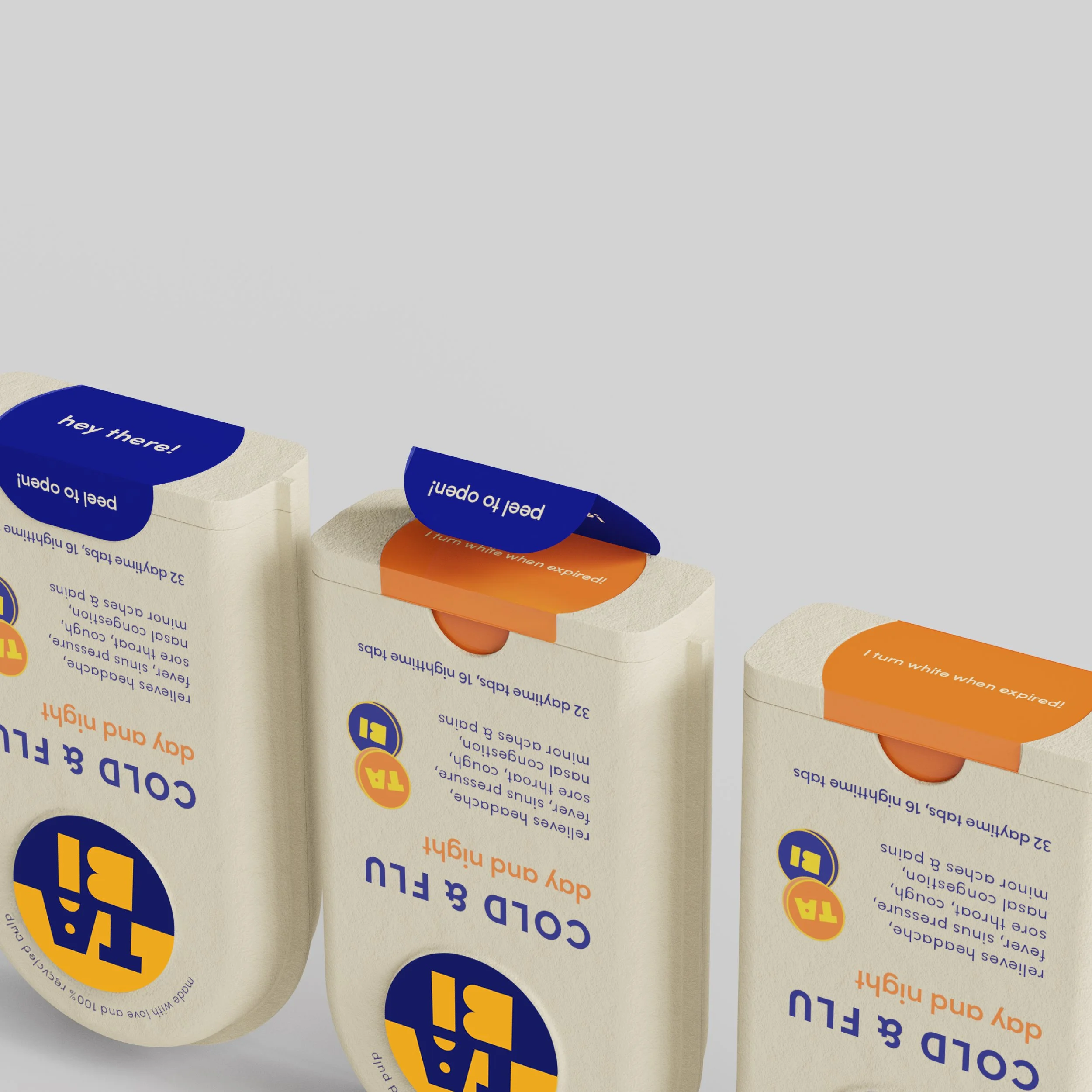
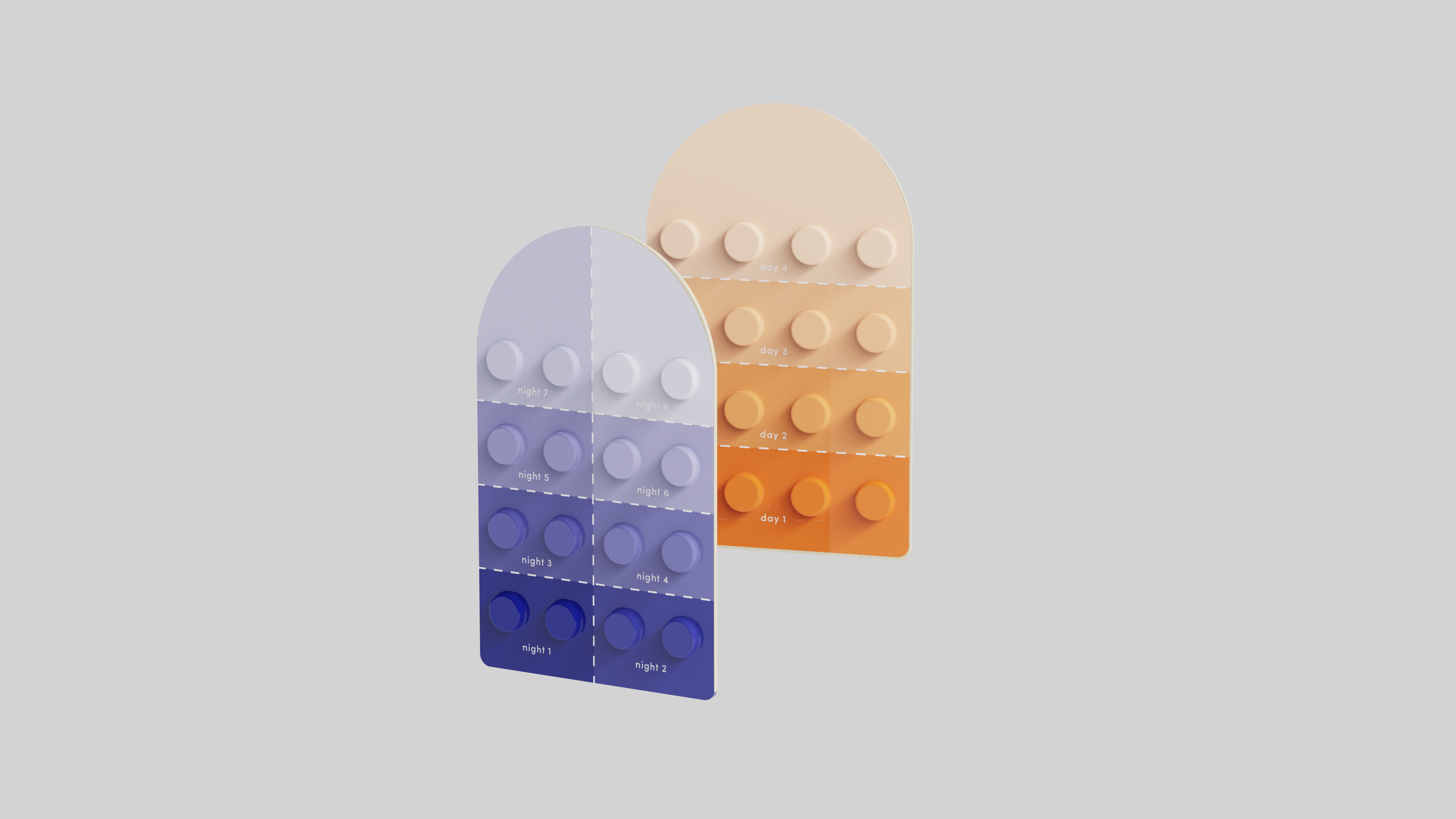
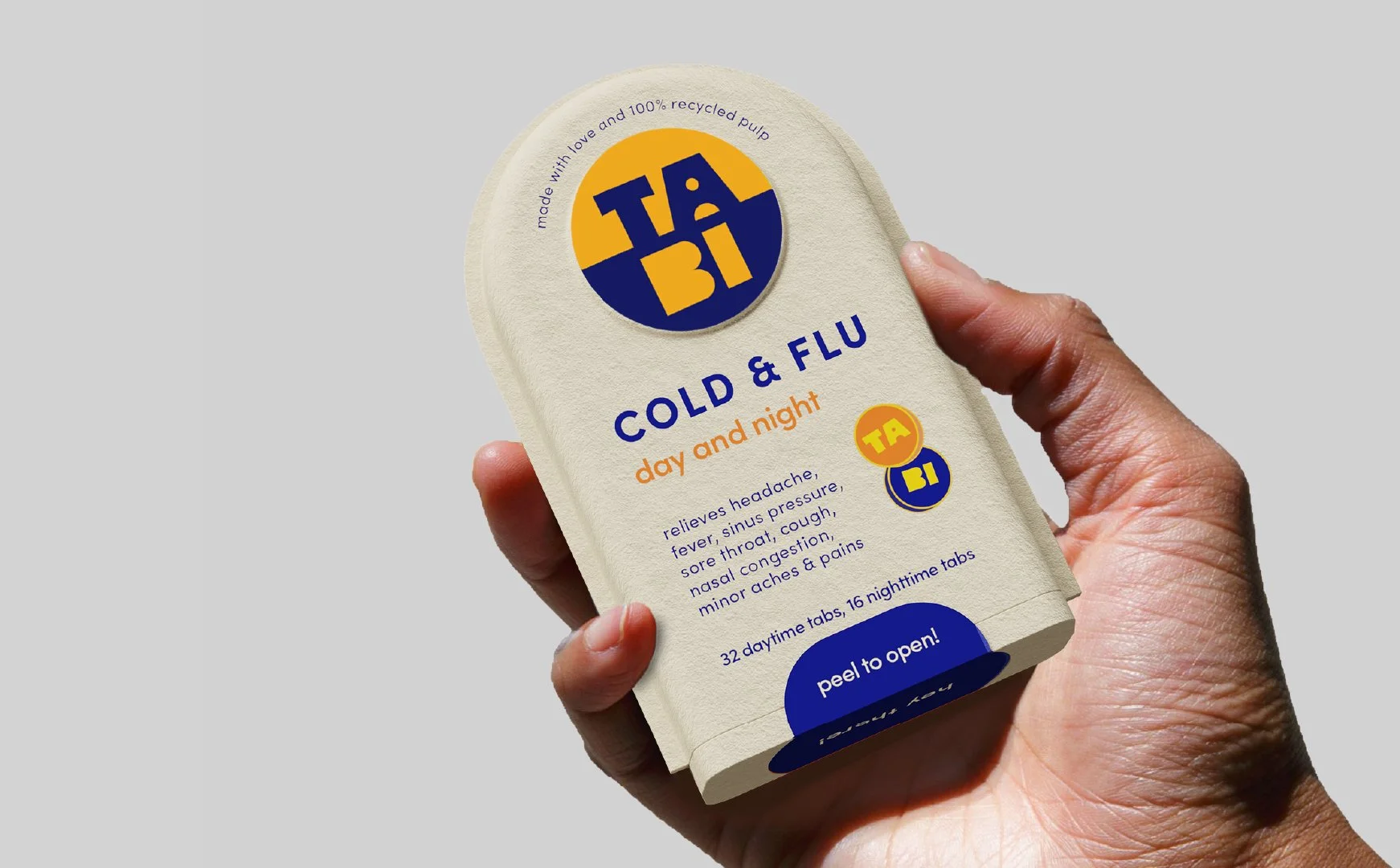
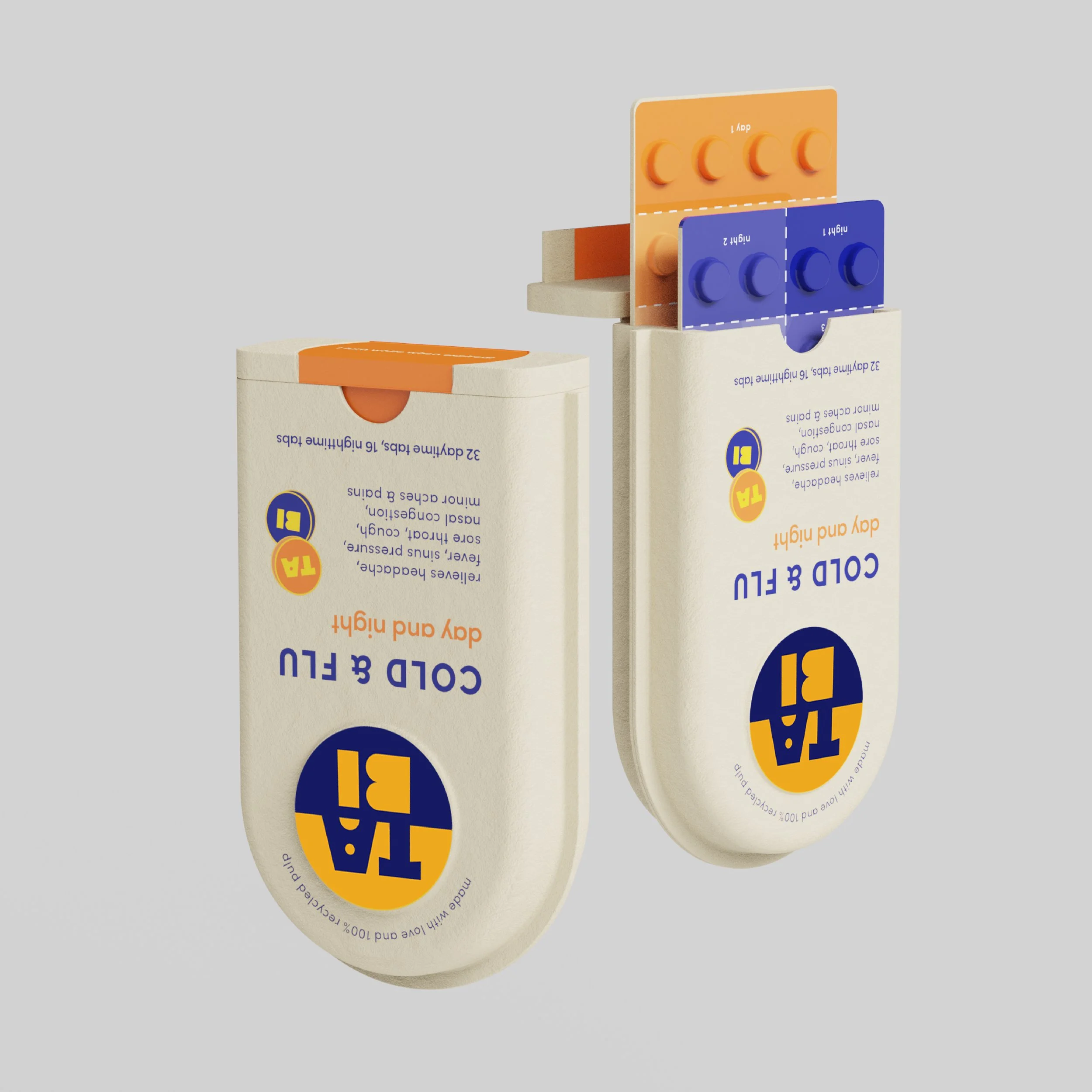
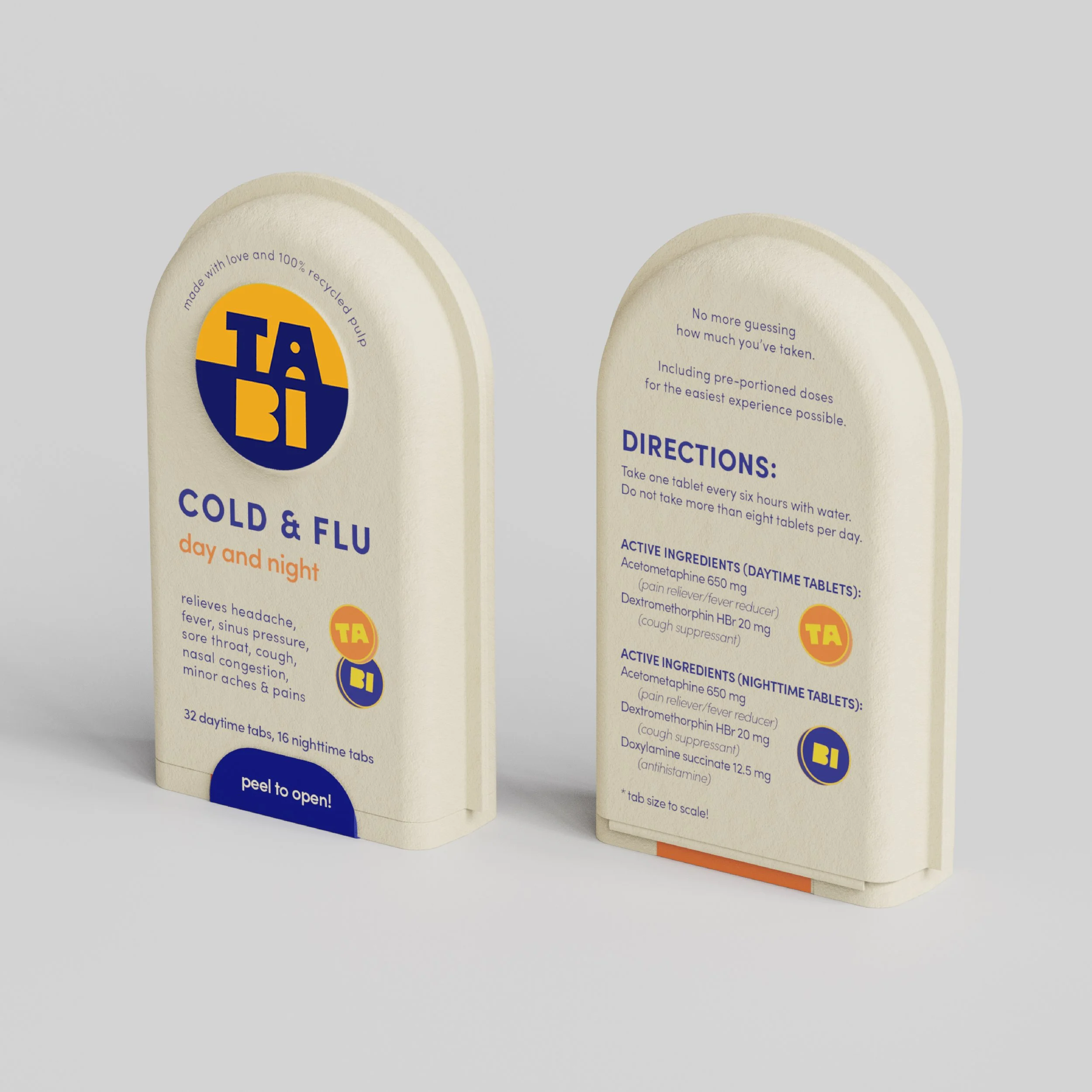
Blister packs are labeled and organized by daily dosage for easiest user experience. Daytime and nighttime blister packs are designated by label and color gradients. The hinged lid for convenience and color changing strip to clearly indicate expiration status.
final mockups
Tabi’s distinct form shape and disrupting packaging design, along with color-coordinated blister packs creates a unique user experience. The friendly and welcoming messaging and instruction language is unlike anything in the category.